
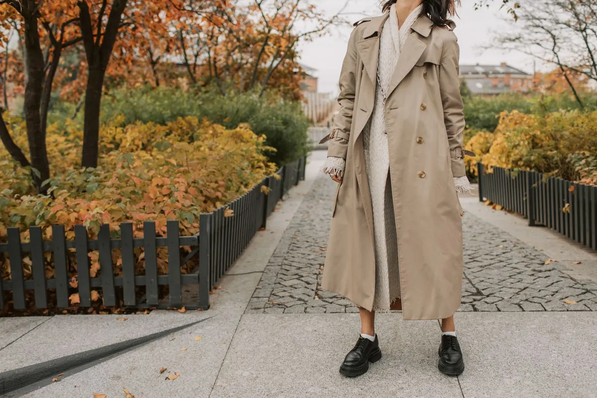
Color Theory for Beginners: How to Mix and Match Outfits

You own a blue shirt and a green pair of trousers. Separately, each looks great. Together, something feels slightly off, and you can't explain why. That quiet sense of wrongness is color talking, and it's a language you can learn in an afternoon.
Color theory for fashion isn't about memorizing rules or dressing by formula. It's about understanding a handful of relationships between colors so you can make decisions in seconds — in a fitting room, in front of a mirror, at 7 a.m. before your coffee has done its job. Once you can see those relationships, you stop guessing and start choosing.
Hue, Value, Saturation: The Only Three Words You Need
Most people talk about color as if it were one thing. It's actually three, and separating them solves most outfit problems.
Hue is the color's name: blue, green, red, orange. Value is how light or dark it is. Saturation is how bright or muted it is — think the difference between a highlighter and a faded pair of chinos.
Here's why this matters. When two pieces feel like they're fighting, the culprit is usually value, not hue. Navy and light blue are the same hue at different values, and they sit together beautifully. A bright white shirt and a pale cream shirt are both technically neutral, but their values are close, which makes the pairing look accidental rather than intentional.
Try this test. Photograph two garments side by side in black and white, using your phone's filter. If they suddenly read as the same shade of grey, the outfit will look flat. If one is clearly lighter, you have contrast — and contrast is what makes an outfit look deliberate.
The Color Wheel, Without the Art Class
You don't need to memorize a wheel. You need three relationships.
Analogous colors sit next to each other: blue, teal, green. These combinations are calm, easy and hard to get wrong. If you're building confidence, live here for a while.
Complementary colors sit opposite each other: blue and orange, purple and yellow, red and green. These are high-energy pairings. The mistake is splitting them fifty-fifty, which can look like a sports uniform. Use one as the base and the other as an accent — a rust knit over dark denim, a mustard scarf against a plum coat.
Triadic colors are evenly spaced, like red, yellow and blue. It's the hardest to pull off in clothing, and usually works best when two of the three are muted and only one is bright.
Four Combinations That Work Every Time
If you want a shortcut, these four formulas cover the vast majority of good outfits.
- Monochrome. One hue, several values. Cream shirt, tan trousers, chocolate jacket. It reads as considered and makes you look taller because the eye travels in one unbroken line.
- Analogous. Neighbors on the wheel. Navy trousers, teal shirt, sage jacket. Relaxed and cohesive without being boring.
- Complementary with restraint. A blue base with an orange accent. Charcoal and cream with a single red shoe. One loud note, everything else quiet.
- Neutral plus one. Grey, white and black are your canvas; add a single color you love. This is the most forgiving formula in the book.
The 60-30-10 Rule Keeps Proportion Honest
Color choices fail as often through proportion as through pairing. A simple guide: roughly 60 percent of your outfit in a dominant color, 30 percent in a secondary one, 10 percent in an accent.
A charcoal coat and trousers (60), a white shirt (30), a rust scarf and bag (10). Or beige knit and trousers (60), a denim shirt (30), green sneakers (10). Nothing about this is sacred — you can push it to 70-20-10 — but it stops an accent color from swallowing the outfit. If your accent is more than a fifth of what you're wearing, it's no longer an accent; it's the main event, and you should treat it that way.
Neutrals Are More Than Black and White
Neutrals are the backbone of a wearable wardrobe, and there are two families. Warm neutrals — cream, camel, olive, chocolate, warm grey — share a golden undertone. Cool neutrals — navy, true grey, stark white, black — lean blue.
You can mix across families, but do it on purpose. A cool grey suit with a warm camel coat can look sophisticated if a bridging color, like denim or taupe, ties them together. Without that bridge, the pairing can read as mismatched rather than intentional.
Two more things worth knowing. Denim behaves like a neutral, which is why it works with almost everything you own. And black next to navy is completely fine — it looks best when the two differ clearly in value, or when texture separates them, like a matte wool trouser against a satin top.
Skin Tone, Texture and Light
Forget seasonal color typing if it doesn't serve you. There's a simpler method: hold the garment up to your face in daylight, without makeup. Colors that make your skin look even and your eyes look awake are yours. Colors that draw shadows under your eyes or make you look tired are not — regardless of what any chart says.
Texture changes how a color reads. Silk and satin reflect light and make a color appear brighter and richer. Wool, linen and matte cotton absorb it and read softer. The same olive green behaves differently as a satin slip dress and a heavy knit sweater.
Lighting matters too. In dim, warm evening light, saturated colors can turn muddy and similar values collapse into one another. That's the moment for crisp contrast or one bold accent rather than a subtle three-tone story.
Build a Palette You'll Actually Wear
Enough theory. Here's how to apply it this week.
- Choose two neutrals you genuinely like and one or two colors that make you feel good. Three to four colors total is plenty.
- Lay them out together on the bed. If every piece works with at least two others, you have a palette.
- Photograph it and keep the picture on your phone for shopping trips.
- Before buying anything new, ask whether it combines with three things you already own. If not, leave it.
- When in doubt, repeat a value: light with light, dark with dark, plus one point of contrast.
Color isn't a talent you're born with, it's a habit you build. Start with the formulas that feel safe, notice what earns you compliments, and adjust from there. Your closet will get quieter, more coherent, and considerably easier to dress from.
Photo: Helena Lopes / Pexels